8 Interior Secrets Only Luxury Designers Know
The exact strategies top designers use in homes across New York, London, Paris, and Sydney — and why most people never discover them.
Most people renovate a room and still feel something is off. The furniture is expensive, the paint is fresh, the layout makes sense — yet it never quite reaches that level you see in magazine spreads. That gap has nothing to do with budget. It has everything to do with knowledge.
Here are the eight principles that high-end designers in the world’s most design-forward cities rely on — not as abstract concepts, but as practical moves you can apply to any room, any space, any home.
The Rule of Three Lighting Layers
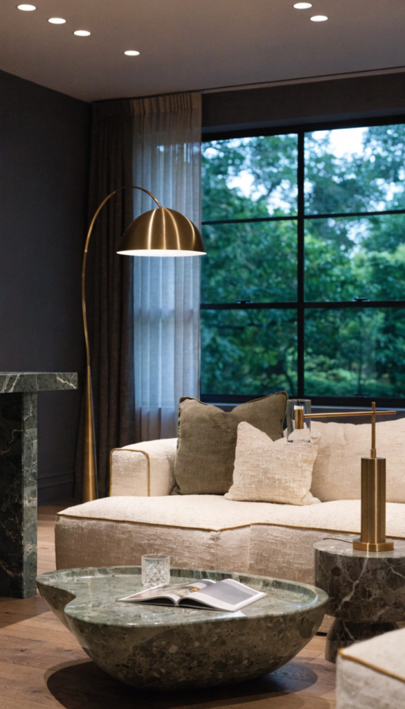
Walk into any five-star hotel lobby or a high-end penthouse apartment and you will immediately feel the difference, even if you cannot name it. The secret is almost always lighting. Specifically, the deliberate stacking of three distinct light sources in every room.
The first layer is ambient lighting — the general fill that replaces daylight. Recessed downlights or a central fixture handle this. The second is task lighting — targeted illumination for reading, cooking, or working. The third, and most neglected, is accent lighting. This is what separates a room that looks designed from one that merely looks furnished.
Never use overhead lighting alone after 6pm. The moment you switch off the main light and rely on lamps and accent fixtures, the room transforms. Shadows become intentional, textures emerge, and the space suddenly feels like somewhere people want to stay.
— A PRINCIPLE SHARED ACROSS EVERY TOP-TIER DESIGN STUDIO
Accent lighting includes picture lights over artwork, LED strips inside shelving, candles on a dining table, and uplighters behind furniture. These do not illuminate a room — they give it depth. Homes in cities like Copenhagen and Tokyo have understood this for decades.
The Double-Height Curtain Illusion
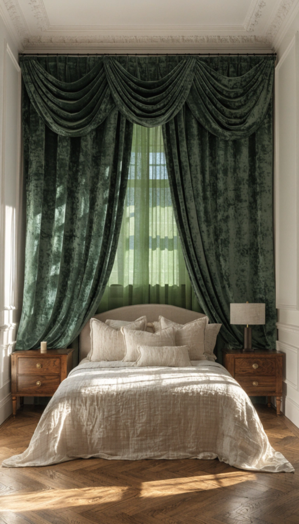
This is one of the most common mistakes in residential interiors worldwide. People hang their curtains at window height, which effectively frames the window — and nothing else. It draws the eye to the glass, stops the gaze there, and makes the wall above feel like dead space.
Luxury designers almost universally mount curtain rods as close to the ceiling as possible and run the fabric all the way to the floor. The result is a vertical sweep that leads the eye upward and dramatically increases the perceived height of the room. It costs nothing extra — the fabric length is the only change.
- Mount the curtain rod 10 to 15 cm below the ceiling, not above the window frame
- Let the fabric pool slightly on the floor for maximum visual drop
- Choose fabrics that fall in clean, straight lines — linen, velvet, or silk blends
- Keep the width at least double the window to allow generous draping when open
This technique works in apartments across London and Paris where ceiling heights are modest and every centimetre of perceived space matters. It is equally effective in sprawling homes in Sydney or Toronto where you want to anchor a room with drama rather than necessity.
Negative Space Is Not Empty Space
Every luxury designer knows the hardest sell to a new client is doing less. People tend to fill rooms because empty space feels like something missing. In reality, it is the most expensive-feeling thing you can have in a home.
Negative space — the intentional areas left without furniture, objects, or visual clutter — is what allows the pieces you do have to be seen properly. A single sculptural lamp on an otherwise bare sideboard looks deliberate and confident. The same lamp surrounded by framed photos, a stack of books, and a decorative bowl looks like overflow.
When a client says their room feels cluttered, I do not reach for more storage. I remove things. The room reveals itself when you stop apologizing for the walls.
— PRINCIPLE PRACTISED BY LEADING STUDIOS IN MILAN AND NEW YORK
This is not minimalism for its own sake. It is the understanding that objects need visual silence around them to communicate their quality. The rooms that feel most luxurious have generous breathing space — between furniture pieces, between walls and furniture, and between objects on a surface.
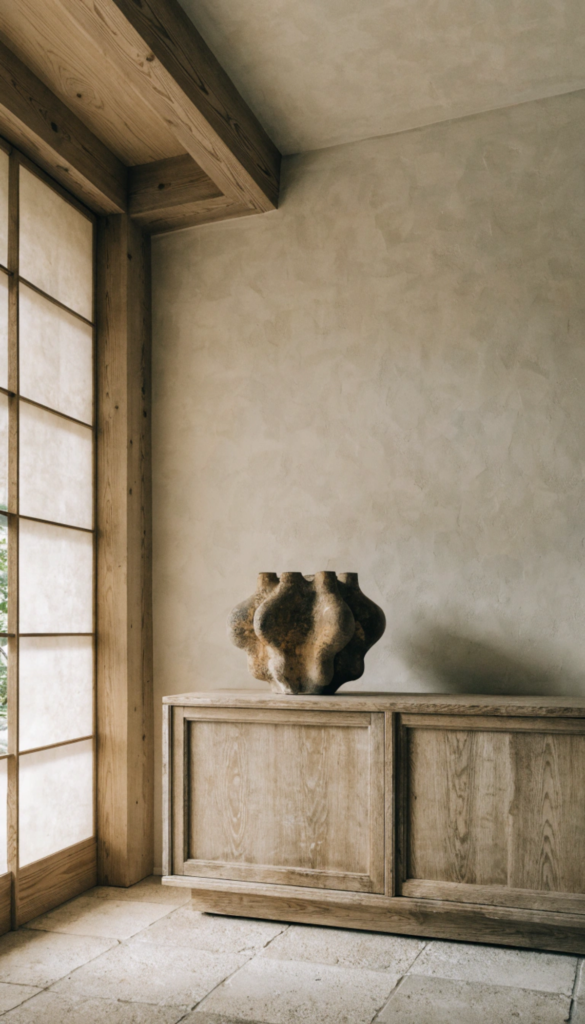
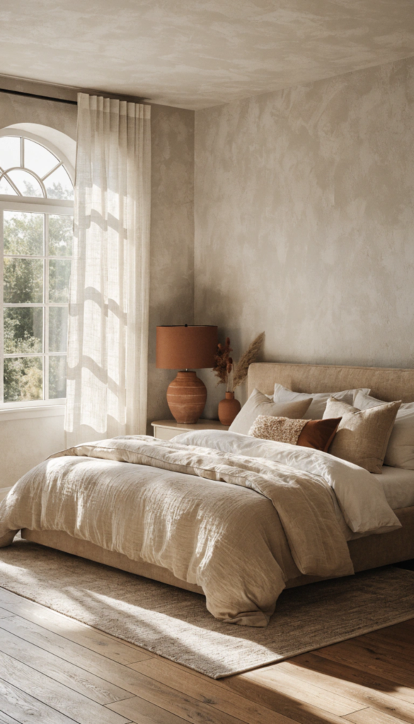
The Power of a Single Statement Material
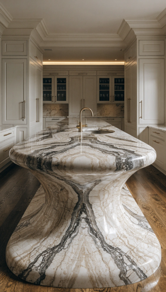
One of the clearest signs of an amateur interior is the presence of many interesting materials competing for attention. Stone, wood, metal, glass, and fabric all asserting themselves in the same room creates visual noise that reads as expensive chaos rather than considered luxury.
The counter-intuitive move that top designers make is to commit fully to one extraordinary material and let everything else defer to it. A book-matched marble island in a kitchen can carry an entire room if the cabinetry, walls, and flooring are calm and neutral. A single wall of textured limewash plaster becomes the personality of a bedroom if the bedding, furniture, and lighting step back.
- Choose one material to be the room’s focal point and budget for quality there
- Every other material should complement, never compete
- Natural materials with inherent variation — stone, wood grain, plaster — carry rooms in ways that manufactured surfaces rarely do
- Repeat the statement material in small doses elsewhere to tie the room together
Layered Rugs and the Art of Grounding
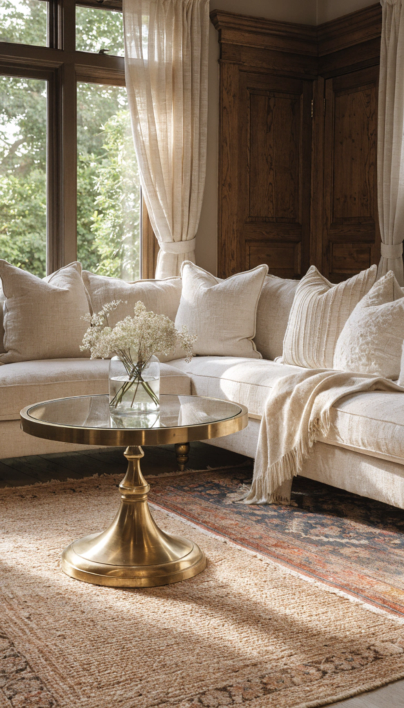
The rug is the most underestimated element in residential design. Most people buy a rug that is too small and place it so that no furniture legs sit on it at all. The result is a room where every piece of furniture appears to be floating independently, with no visual relationship to each other or to the floor.
Luxury designers insist on two things: size and placement. The rug should be large enough for at least the front legs of every sofa and chair in the seating area to rest on it. This anchors the furniture into a cohesive grouping and makes the room feel intentional.
The layering technique — placing a smaller, more decorative rug on top of a larger, neutral one — adds depth, texture, and the kind of relaxed confidence that characterises interiors in cities like Amsterdam and New York’s West Village. It also allows you to introduce pattern or colour without committing the entire floor to it.
Asymmetric Styling Over Perfect Symmetry
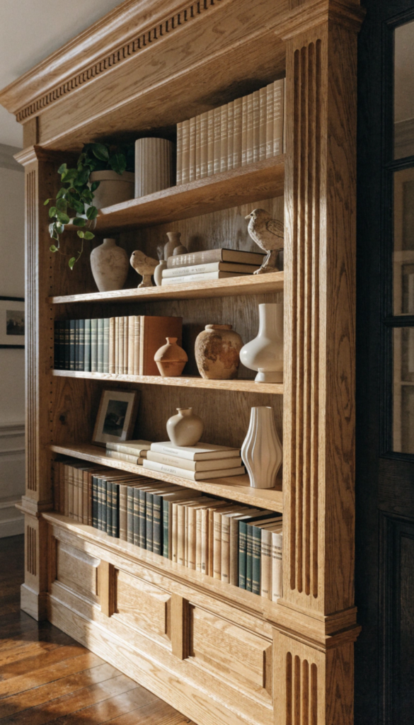
There is a version of a well-designed room that feels cold. Matching lamps on both sides of a bed, identical vases on either end of a console table, books arranged by colour in a grid — everything balanced, everything controlled, nothing surprising. It looks correct and feels dead.
The most compelling interiors have a quality of studied imperfection. Objects are grouped in odd numbers. Shelves mix books with objects of varying heights. A single overscale lamp replaces the matching pair. This is not carelessness — it takes more skill and confidence than symmetry does. Symmetry is a formula. Asymmetry is a conversation.
Group objects in threes where possible. Vary the heights — tall, medium, low — and vary the materials. One object should be organic, one geometric, one with personal meaning. That is the whole formula.
— STANDARD STYLING RULE ACROSS PARIS AND MILAN ATELIERS
The 60-30-10 Colour Architecture
Colour intimidates people, and understandably so. Most rooms that go wrong do so because of colour — either too much variety, too little confidence, or the wrong proportions. The 60-30-10 rule is the structure that luxury designers apply to prevent exactly this.
Sixty percent of the room is dominated by a single colour — typically the walls, ceiling, and largest furniture pieces. This is your neutral or base tone. Thirty percent is a secondary colour that appears in upholstery, bedding, curtains, and large accessories. Ten percent is the accent — the colour that adds tension and interest. This usually lives in cushions, artwork, a single chair, or decorative objects.
The reason this works consistently is proportion. The accent colour at ten percent creates impact precisely because it is scarce. A terracotta cushion in a room of greige and ivory reads as sophisticated. Terracotta at forty percent reads as a renovation from the nineties. Same colour, completely different result.
Art at Eye Level Is the Minimum — Not the Goal
Most guidelines tell you to hang art at 145 to 150 centimetres from the floor to the centre of the piece — roughly eye level for an average adult. This is a safe, neutral rule that results in art that looks technically correct and entirely forgettable.
Luxury designers treat art placement as a design decision in its own right. Art hung above a sofa should be close enough to feel connected to it — typically 15 to 20 centimetres above the furniture, not floating in the middle of the wall. A single large piece hung lower than convention allows, almost touching the surface below, creates a composed, gallery-like relationship between the object and the art that signals real intent.
- Hang art in relationship to the furniture below it, not in the abstract middle of the wall
- Scale matters more than medium — one large piece outperforms three small ones in most rooms
- Leave walls intentionally bare in some rooms to give framed pieces elsewhere more power
- Light the art directly if budget allows — a picture light or focused track light transforms any print into a statement
In the design capitals — London, New York, Paris, Milan, Tokyo — the homes and hotels that stop you in your tracks almost always have art that is placed with the same rigour as the furniture. It is not decoration. It is architecture.
The gap between ordinary and extraordinary is smaller than you think.
None of these principles require a redesign or a significant budget increase. They require observation, restraint, and the willingness to make decisions with conviction rather than defaulting to what feels safe. That is what every designer worth hiring actually charges for — not the objects they specify, but the clarity of thought behind them.
Fene Radebe is the founder of Lifestyle Leaders Hub, a lifestyle destination covering home décor, fitness, food, beauty, and fashion. A seasoned property developer and interior designer, Fene curates expert-driven content to help readers elevate their everyday lives with purpose and style.