Choosing the right paint colors for your home can feel overwhelming. With countless options out there, it’s easy to get lost in a sea of shades and hues. That’s why I’ve put together this guide on the best neutral paint colors that interior designers use time and again. Neutral tones are not just a backdrop; they create a foundation for your space, setting the mood and style of your home. Whether you’re revamping a room or starting fresh, these tried-and-true colors can help you achieve a polished look.
If you’re a homeowner, an aspiring decorator, or simply someone who loves home decor, this post is just for you. You might be searching for a calming palette or a chic update for your living room. Either way, you want colors that will stand the test of time and complement various furnishings. This guide features ten stunning neutral paint colors that will elevate your interior design game. You’ll discover what makes each shade unique and how to use them effectively in your home.
By diving into this list, you’ll gain valuable insights into choosing the right neutral paint colors that work for your space. These colors are versatile, stylish, and perfect for creating a cozy atmosphere. Get ready to transform your home into a serene haven with colors that interior designers love!
Key Takeaways
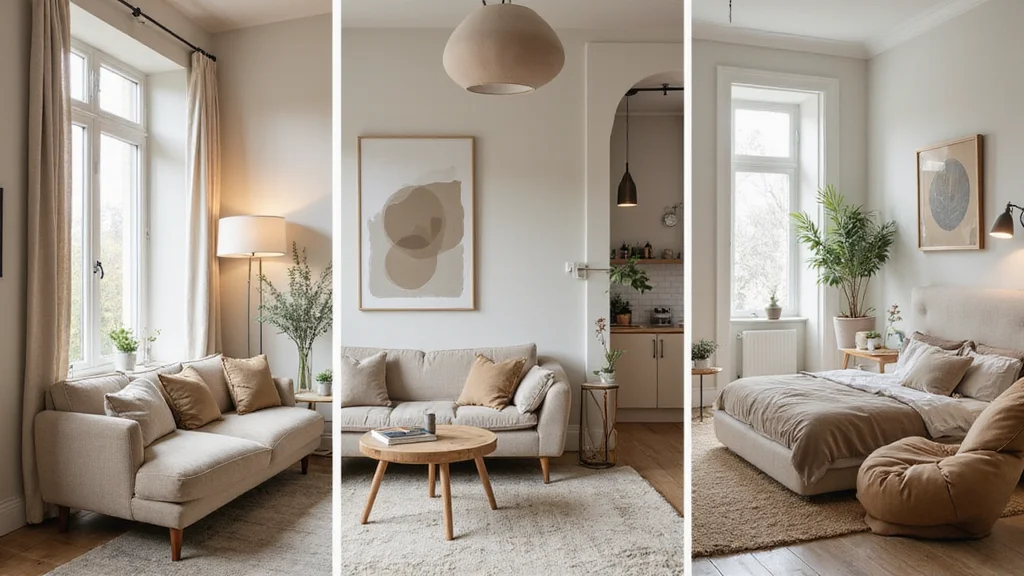
– Soft White: This timeless classic adds brightness and can make spaces feel larger and airier. It pairs well with other colors for a fresh look.
– Warm Taupe: An earthy tone that offers elegance and warmth. It’s perfect for creating a cozy atmosphere in living rooms and bedrooms.
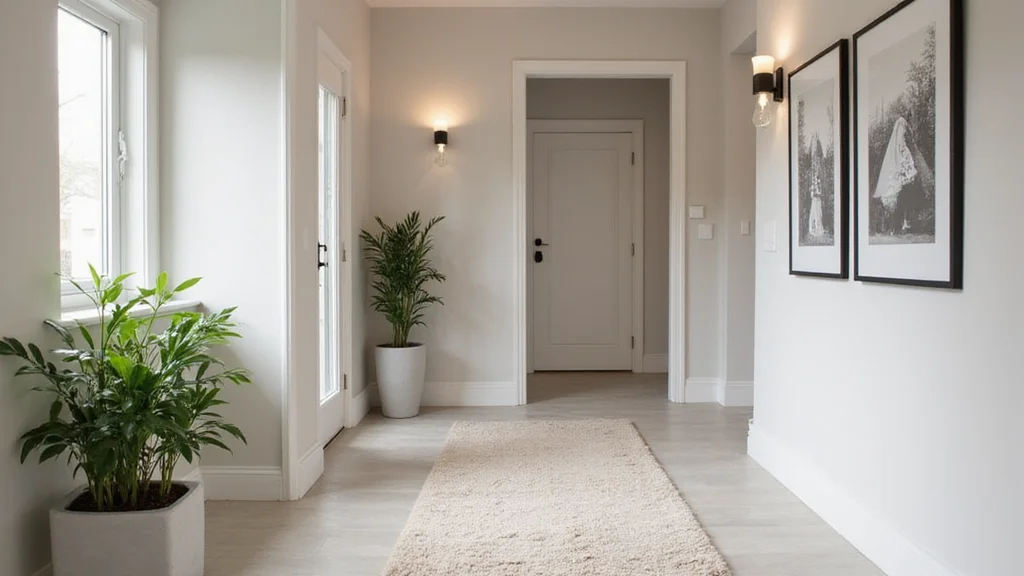
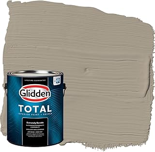
– Greige: A blend of gray and beige, making it the best of both worlds. It works well in many settings, adding depth without overwhelming.
– Pale Gray: This subtle shade brings sophistication to walls. It’s ideal for modern and traditional styles alike.
– Soft Beige: A comforting and warm neutral that can make any space feel inviting. It’s great for creating a serene environment.
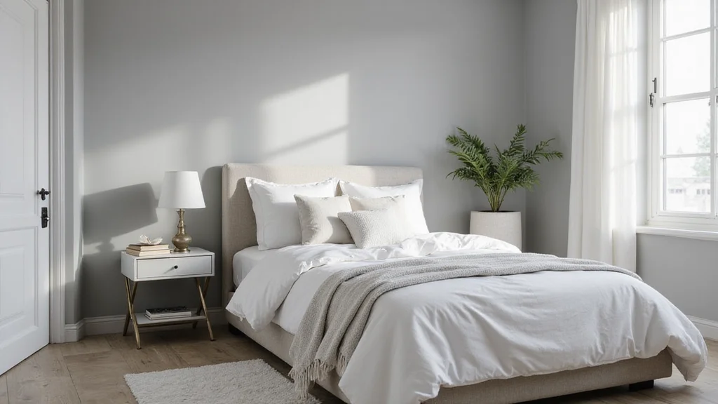
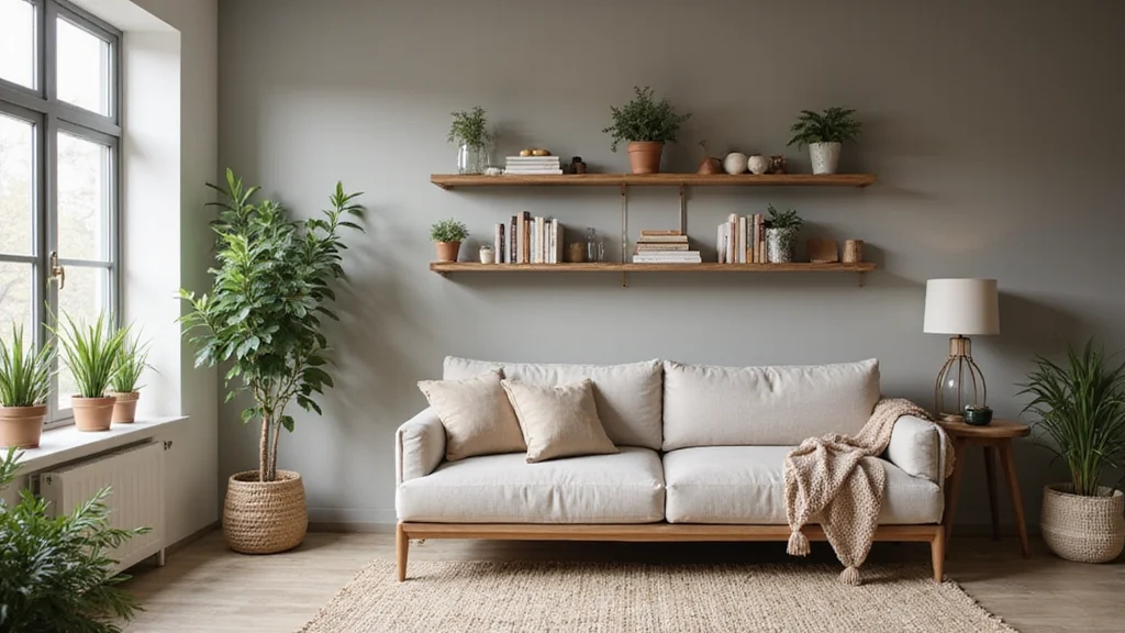
1. Soft White – The Timeless Classic
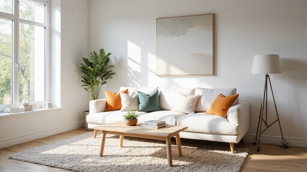
Soft white stands out as a classic choice among designers. Its crisp yet warm nature brightens spaces while avoiding a sterile feel, creating a welcoming environment.
This shade enhances darker accents, such as black frames and rich wood furnishings, resulting in a striking contrast that elevates any room. It harmonizes beautifully with materials like metals and textiles, offering versatility across various design styles from contemporary to classic.
To maximize soft white’s potential, consider:
– Test swatches in various natural light settings to find the ideal shade.
– Layer different fabrics and finishes to add dimension and depth.
– Introduce colorful decor pieces to infuse personality into your soft white backdrop.
Ultimately, soft white serves as a versatile canvas for any decor style, enhancing the overall aesthetic with its timeless charm.
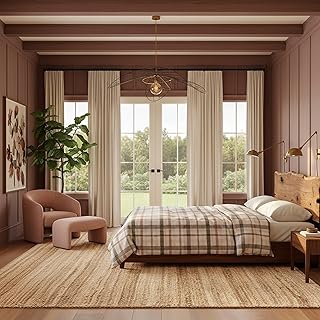
2. Warm Taupe – Earthy Elegance
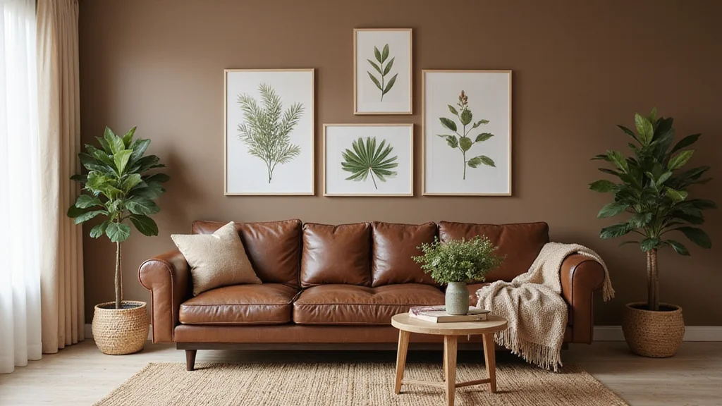
Warm taupe brings a touch of earthy elegance to any space, featuring a gentle blend of brown and gray tones that lend it incredible versatility. Its warm undertones beautifully complement natural wood finishes and organic materials, making it a favorite among designers.
This shade fosters a cozy atmosphere, perfect for living areas and bedrooms alike. The subtle warmth creates a serene environment that feels inviting and comforting.
When working with warm taupe, keep these tips in mind:
– Incorporate greenery to amplify the earthy vibe.
– Experiment with contrasting textures like smooth leather and soft linen for added interest.
– Pair with bright white trims to keep the overall look light and engaging.
Warm taupe is an excellent choice for those who want to maintain a neutral palette while inviting warmth into their spaces.
Warm Taupe – Earthy Elegance
Editor’s Choice


3. Greige – The Best of Both Worlds
Greige, a harmonious blend of gray and beige, has become increasingly popular for its welcoming nature and versatility. This adaptable color offers the coolness of gray while maintaining the warmth of beige, making it a superb choice for various design aesthetics.
Designers adore greige for its ability to complement both warm and cool color palettes, allowing it to fit seamlessly into any decor.
To effectively incorporate greige into your space, consider:
– Always test the color in your lighting conditions to ensure the perfect fit.
– Use it as a base color to let other textures and hues shine.
– Mix with metallics like gold or silver for an elegant touch.
Greige perfectly balances warmth and coolness, creating a sophisticated atmosphere in any room.
Greige – The Best of Both Worlds
Editor’s Choice


4. Pale Gray – Subtle and Sophisticated
Pale gray is a beloved choice for many designers, providing a soft touch that works harmoniously in both modern and traditional settings. It instills a sense of tranquility in spaces, making them feel more expansive and open.
This shade serves as a gentle backdrop, allowing bolder colors and textures to take center stage, enhancing the overall design.
To get the most from pale gray, consider these strategies:
– Layer with pastel colors to create a soft and inviting atmosphere.
– Contrast with darker furniture to add depth and intrigue.
– Be mindful of undertones, as warm or cool grays can influence decor choices.
This neutrality positions pale gray as a fantastic choice for anyone aiming to cultivate a peaceful and sophisticated environment.
Pale Gray – Subtle and Sophisticated
Editor’s Choice


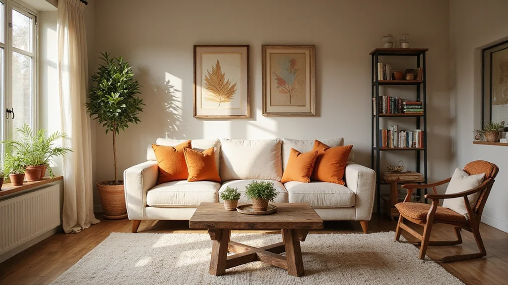
5. Soft Beige – Comforting and Warm
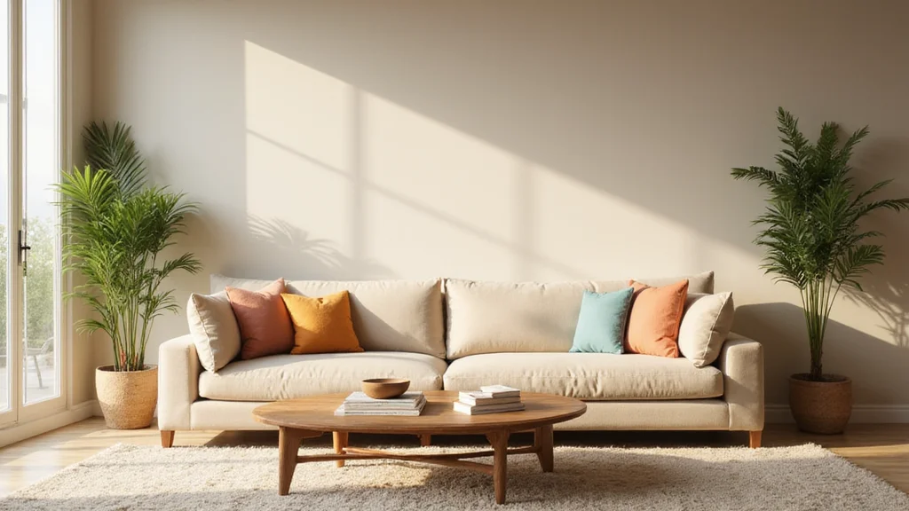
Soft beige is a timeless color that exudes warmth and comfort, making it a favorite among designers. Its inviting nature is perfect for creating cozy living rooms or serene bedrooms that feel both sophisticated and approachable.
By embracing soft beige, you can craft welcoming spaces that feel effortlessly stylish.
To enhance your space with soft beige, try:
– Accentuating with bold colors like navy or emerald green for dramatic contrast.
– Incorporating natural materials such as wicker, wood, and stone to achieve an organic feel.
– Mixing in patterned accessories, like cushions or rugs, to add visual interest without overwhelming the softness.
Soft beige truly stands out as the ideal hue for anyone looking to cultivate a warm and inviting atmosphere.
You might also like
6. Biscotti – A Delightful Neutral
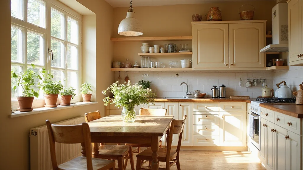
Biscotti, a creamy light beige, adds a delightful warmth to any decor style. This inviting color is especially effective in kitchens and dining areas, providing a soft, airy ambiance.
Designers often select biscotti for its ability to create a peaceful environment while allowing other colors to shine.
To incorporate biscotti effectively, keep these tips in mind:
– Pair with warm wood tones to enhance its inviting qualities.
– Use it as a warm backdrop for brighter colored accessories, creating lively contrasts.
– Incorporate soft textures, like linen and cotton, to amplify the cozy feel.
This delightful color infuses lightness and warmth, making spaces feel friendly and welcoming.
7. Driftwood – Nature’s Touch
Driftwood is a unique grayish-brown that captures the essence of weathered wood. This neutral tone, rich with rustic charm, is perfect for beach houses and cozy retreats alike.
Designers appreciate driftwood for its ability to ground a space, creating a chic yet relaxed atmosphere.
To make the most of driftwood, consider these strategies:
– Mix with earthy tones like greens and browns for a cohesive vibe.
– Layer natural materials such as jute and linen to enhance the organic feel.
– Use bright accents to help driftwood pop while maintaining harmony.
This color beautifully complements nature, fostering a calming environment that feels like a serene escape.
Driftwood – Nature’s Touch
Editor’s Choice


8. Cool Beige – A Touch of Modernity
Cool beige offers a modern twist on traditional beige, featuring subtle gray undertones that create a sleek, contemporary appearance. This shade is perfect for crafting sophisticated spaces that feel fresh and inviting, making it a popular choice among modern designers.
Cool beige pairs well with both warm and cool colors, providing endless decorating options.
To achieve the best results with cool beige, consider:
– Combining it with bold colors like deep blues or rich jewel tones for striking contrasts.
– Utilizing minimalism with clean, simple furniture lines to enhance the modern feel.
– Experimenting with glossy and matte finishes to add depth without overpowering the softness.
This modern neutral is ideal for creating stylish yet inviting spaces.
You Might Also Like
9. Light Mushroom – A Cozy Touch
Light mushroom is a unique neutral that creates a cozy and inviting ambiance reminiscent of soft earth tones. This color works beautifully in any room, offering a warm backdrop that feels both sophisticated and relaxed.
Designers appreciate how light mushroom can soften a space while allowing decor to shine.
To use light mushroom effectively, consider these tips:
– Layer with warm tones like peach or burnt orange for a balanced look.
– Incorporate wooden elements to enhance the warmth of this lovely color.
– Add depth with textured accessories like throw pillows and rugs.
Light mushroom is perfect for those seeking a cozy yet chic atmosphere.
10. Pale Greige – The Easiest Neutral
Pale greige stands out as the ultimate neutral, striking a perfect balance between warmth and coolness. This shade is highly versatile, fitting seamlessly into both modern and traditional environments.
Designers value pale greige for its ability to transition effortlessly from one room to another, creating a cohesive flow throughout the home.
When working with pale greige, consider these strategies:
– Use it as a base color for larger areas, allowing light and space to feel expansive.
– Accessorize boldly with colorful art or decor to create eye-catching focal points.
– Opt for warm lighting to enhance the cozy feel of this shade.
Pale greige simplifies any design aesthetic, making it an excellent choice for those desiring a unified look throughout their home.
Pale Greige – The Easiest Neutral
Editor’s Choice


Conclusion
Choosing the right neutral paint color can be a game-changer when it comes to designing your space.
From soft whites to cozy taupes, each color offers something unique, helping you create an environment that reflects your style and personality.
As you explore these options, remember that the best choice is one that resonates with you and enhances your living experience.
Note: We aim to provide accurate product links, but some may occasionally expire or become unavailable. If this happens, please search directly on Amazon for the product or a suitable alternative.
This post contains Amazon affiliate links, meaning we may earn a small commission if you purchase through our links, at no extra cost to you.