How Layering Fabrics and Materials Elevates Any Interior to Luxury Status
A Definitive Guide to Tactile Luxury in Modern Interiors
Walk into any room that stops you in your tracks and you will almost always find the same secret at work. It is not the price tag on the furniture. It is not the square footage of the space. It is texture. The way a nubby linen cushion sits against a polished marble side table. The contrast between a rough stone wall and a silky velvet sofa. The moment your hand trails across a cashmere throw and something in your body simply exhales.
Texture is the language luxury speaks without saying a word. In the world’s most coveted interiors, from the penthouses of New York and London to the Scandinavian retreats of Oslo and the sun-drenched villas of Sydney, designers understand that layering materials is what separates a beautiful room from an unforgettable one.
This guide will show you exactly how to do it, whether you are starting from scratch or looking to transform a space you already live in.
Luxury is not what you see. It is what you feel.
Why Texture Matters More Than Colour or Furniture
Most people renovate by chasing colour palettes and statement pieces. They spend months selecting paint swatches and arguing over sofa silhouettes. Yet the rooms they end up with often feel hollow or somehow unfinished, and they cannot explain why.
The answer is almost always texture. Colour sets mood. Furniture provides function. But texture creates presence. It gives a room physical weight, sensory depth, and what interior designers call ‘layered warmth’, the quality that makes a space feel lived-in and intentional rather than staged.
Research in environmental psychology consistently shows that humans process tactile variety as a signal of abundance and safety. When a space incorporates multiple material surfaces, whether touched directly or simply perceived visually, the brain reads it as rich, curated, and high status. This is not a decorating trend. It is how human perception works.
The best part? You can achieve this effect at virtually any budget. Layering texture is largely about sourcing and intentionality, not about spending more money on fewer things.
The Core Principle: Visual Weight and Tactile Contrast
Before you begin layering, it helps to understand one foundational idea: visual weight. Every surface in a room either absorbs light or reflects it. Matte finishes absorb light and feel grounded. Glossy surfaces reflect it and feel energised. A room filled entirely with one or the other becomes either oppressively heavy or uncomfortably stark.
The magic happens in contrast. Place a rough, handwoven jute basket beside a smooth lacquered console table and both objects become more interesting. Position a matte plaster wall behind a polished brass light fixture and the metal suddenly glows. These pairings work because each material defines the other.
Think of your space as a composition with three tiers of texture:
Anchor textures are your largest surfaces, including floors, walls, and large upholstery. These should be relatively restrained because they set the baseline. Polished concrete, wide-plank oak, or raw linen are excellent anchor choices.
Mid-layer textures are your medium-sized elements such as rugs, curtains, and cushions. This is where you can introduce the most variety and contrast, pairing smooth against rough and matte against sheen.
Accent textures are your smallest touches, including decorative objects, throws, and hardware. These are your punctuation marks. A single piece of carved travertine on a shelf, a handful of hand-thrown ceramic vessels, or aged brass cabinet handles can elevate an entire room.
Think of textures as a conversation between surfaces. Each one should respond to the others.
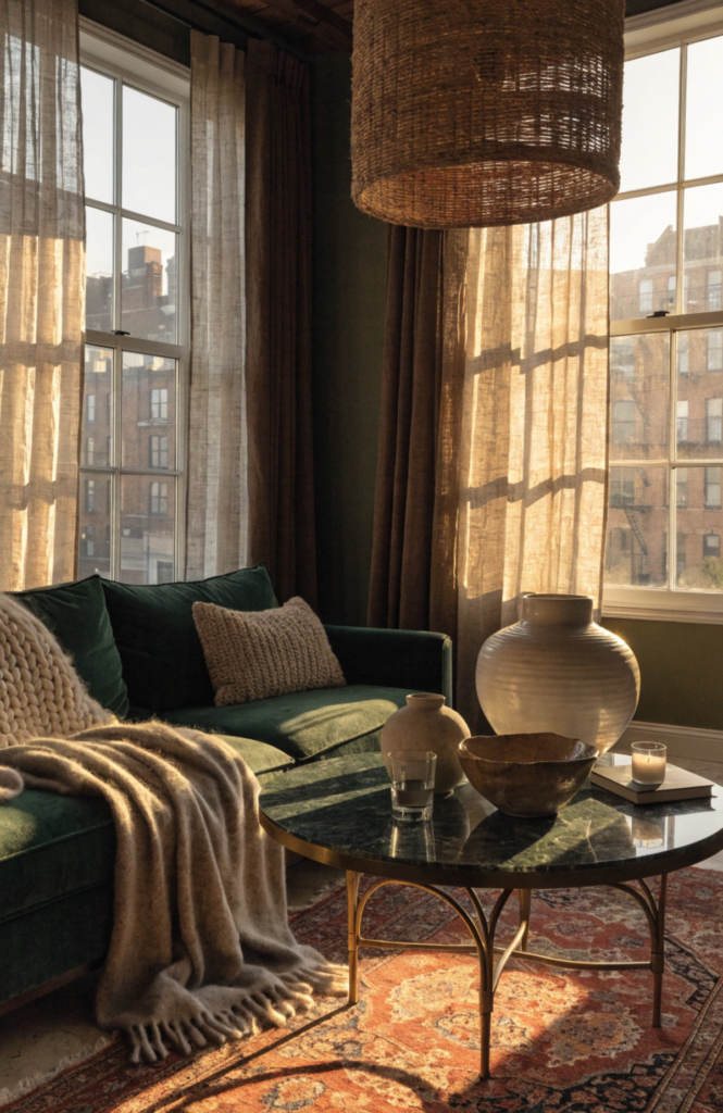
Fabric Layering: The Art of Soft Furnishing
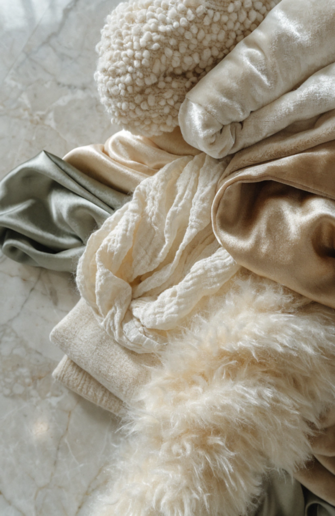
Fabric is the fastest and most affordable way to introduce texture into any space. A single shift in your soft furnishings can change the entire sensory register of a room.
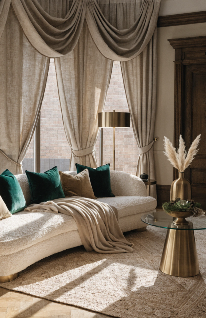
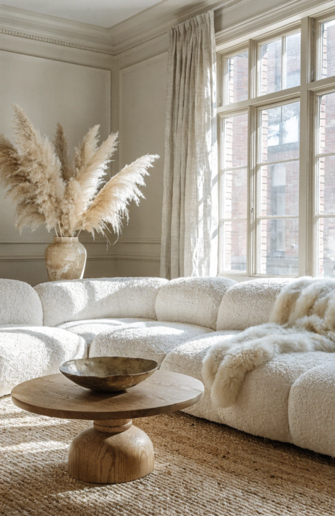
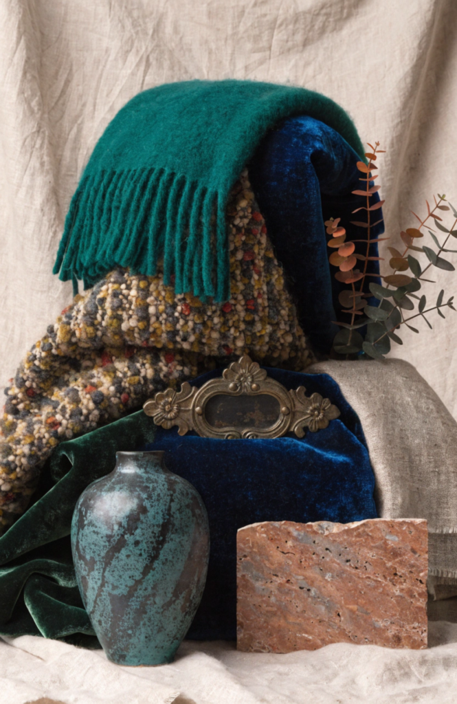
Start with the sofa. The upholstery you choose anchors the entire seating zone. Bouclé, the looped wool-blend fabric that has become a staple in luxury interiors worldwide, offers exceptional visual warmth and holds its shape beautifully over years of use. Velvet delivers deep colour saturation and a directional pile that catches light differently depending on the angle, making it feel dynamic rather than flat. Linen and cotton are cooler and more casual but layer exceptionally well when you add richness through cushions and throws.
Cushions deserve more creative attention than most people give them. A confident cushion strategy mixes at least three different fabric types: something smooth like silk or sateen, something nubby like boucle or raw linen, and something with dimension like a cable-knit or embroidered design. Vary the sizes and avoid symmetrical arrangements. Luxury feels curated, not coordinated.
Throws are arguably the single highest-impact decorating tool available. A cashmere or merino throw draped casually over the arm of a sofa or the corner of a bed signals relaxed opulence in a way that even the most expensive furniture cannot. It reads as lived-in rather than staged. In showrooms throughout Paris, Milan, and London, this small gesture is almost never overlooked.
For window treatments, prioritise weight and drape over pattern. Floor-to-ceiling linen curtains that pool slightly on the floor make ceilings feel higher and rooms feel more generously proportioned. The pooled fabric is deliberately excess, a deliberate signal that space and quality are not things being rationed here.
Hard Material Layering: Stone, Wood, Metal and More
Hard materials form the structural skeleton of textural layering. They set the permanent backdrop against which your soft furnishings perform.
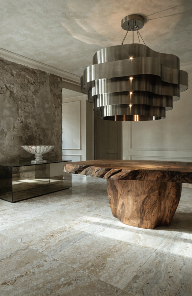
Stone is perhaps the most powerful textural material available to an interior designer. Travertine with its natural pitting and warm ivory tones, marble with its cool veining, and slate with its dense matte surface all read as irreplaceable and expensive precisely because they are the product of millions of years of geological time. You cannot replicate that quality with a laminate, regardless of how convincing the print.
Wood brings warmth and biological connection that no manufactured material can fully achieve. The key is grain variation and surface treatment. A wire-brushed oak floor that reveals its grain structure is categorically more interesting than a smooth-sanded one. A live-edge walnut dining table, with its uncut natural perimeter, introduces organic irregularity that makes a room feel connected to the world beyond its walls.
Metal accents are your room’s jewellery. Brushed brass, unlacquered bronze, blackened steel, and oxidised copper all age in ways that actually improve with time, developing patinas that carry the history of use. Avoid chrome in domestic interiors unless used very deliberately. It reads as clinical rather than luxurious.
Glass and mirror deserve careful handling. Used sparingly, a large lean-against-the-wall mirror with a raw wood or plaster frame can double the perceived depth of a room. Smoked glass shelving introduces mystery without weight. But over-reliance on reflective surfaces makes a space feel like a shop rather than a home.
Stone, wood, and metal do not age. They develop. That is the difference between a material and a product.
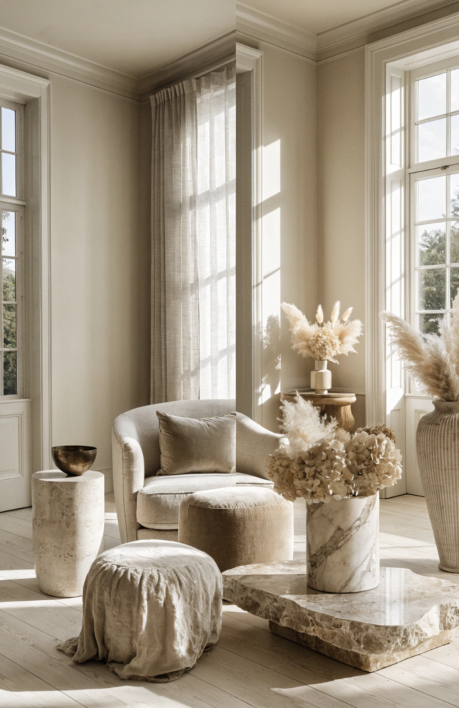
Colour-Neutral Texture: The All-Neutral Room Done Right
Neutral colour palettes have dominated interior design conversations in London, Copenhagen, Sydney, and New York for good reason. When you remove the distraction of strong colour, texture becomes the sole source of interest and depth. Done carelessly, this produces a beige room that feels empty. Done well, it produces something that design publications describe as ‘quiet luxury’, interiors of extraordinary calm and sophistication.
The secret to a successful neutral room is never using the same material twice. If your walls are smooth plaster, your rug should be rough. If your sofa is linen, your cushions should include velvet and knit. If your floor is polished wood, your coffee table should be stone or rattan.
Tonal variation within a neutral palette matters enormously. There is a significant difference between stark white, warm ivory, creamy yellow-white, and cool grey-white. Mixing these tones within a single room creates depth without introducing colour, which is precisely how Scandinavian and Japanese interior traditions achieve rooms that feel both minimal and abundantly rich.
Natural and organic materials dominate the most successful neutral interiors. Handwoven baskets, raw ceramic vases, dried botanical arrangements, unbleached cotton, and unlacquered timber are all deeply textural and deeply human. They remind us that not everything is manufactured, and in rooms full of processed materials, that contrast carries tremendous power.
Room-by-Room Texture Strategy
Different rooms call for different textural strategies based on how they are used and what emotional register they should occupy.
In the living room, the goal is generous warmth. Layer a large textured rug under all your seating. Introduce curtains that reach the ceiling and break slightly on the floor. Mix your cushions and keep the arrangement looking slightly unstyled, as though someone was actually comfortable there recently.
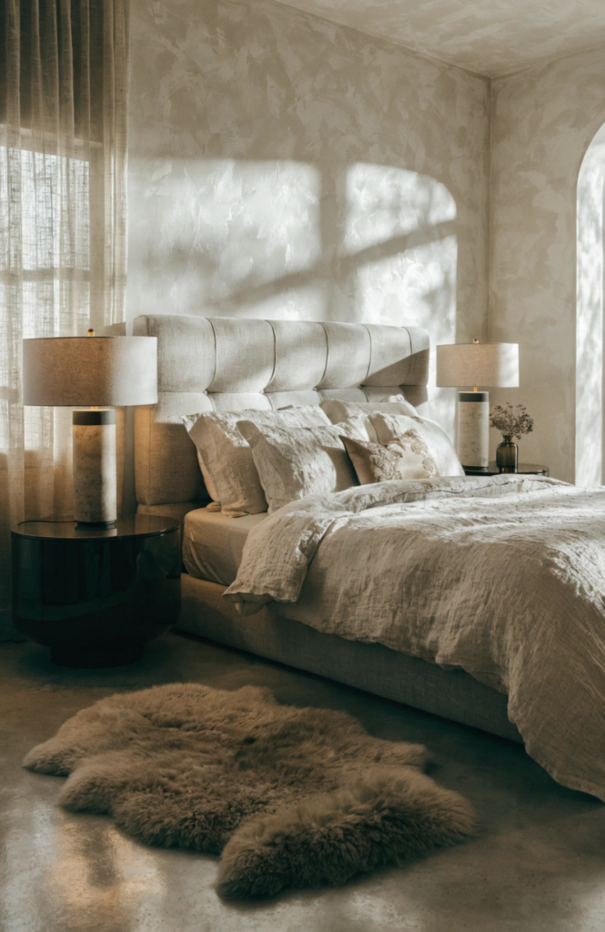
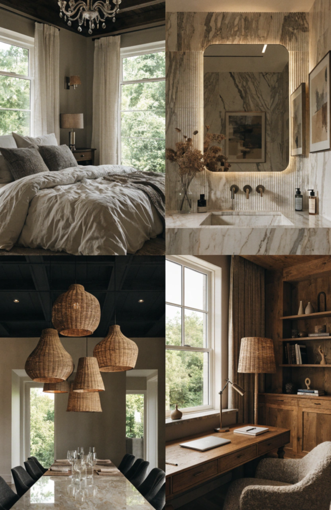
In the bedroom, the priority is sensory quietness and perceived softness. Every surface the body might touch should feel considered. Hotel-quality layered bedding with a mix of thread counts, a bedside rug your feet find first thing in the morning, curtains thick enough to block light and sound, and a carefully placed throw at the foot of the bed create an environment that communicates genuine rest.
In the bathroom, texture works through material rather than fabric. Fluted marble or limewashed plaster walls add tactile interest. Brushed metal taps and towel rails elevate every ordinary gesture. Thick woven towels stacked openly rather than hidden away become part of the room’s texture palette.
In the home office or library, wood panelling, woven lampshades, leather or bouclé chairs, and shelves layered with books and objects of varying materials create intellectual warmth. The message these rooms send is that the person who inhabits them is considered and serious, which in most of the world’s top markets is the most aspirational signal of all.
Practical Shopping Guide: Where to Source Texture
You do not need to visit a flagship showroom to source extraordinary texture. Some of the most tactilely compelling interiors are built from a combination of high-end investment pieces and carefully selected accessible finds.
For textiles, look for makers who specialise in natural fibres: wool, linen, cotton, silk, and cashmere. European weaving traditions in Belgium, Portugal, and Scotland produce linens and wools of exceptional quality that are available internationally. For throws and cushions, small-batch artisan producers found on curated design marketplaces often outperform mass-market alternatives at similar price points.
For hard materials, seek out reclaimed and salvaged stone. Reclaimed flagstones, antique parquet, and secondhand marble carry textural history that new materials simply cannot replicate. Architectural salvage yards in the UK, France, and the Netherlands are extraordinary sources.
For furniture, invest most in your largest anchor pieces. A well-made upholstered sofa in a textural fabric will carry your room for fifteen years. Spend less on decorative accessories, because this is where texture is most easily found at accessible price points: handthrown ceramics, rattan baskets, and natural dried botanicals are widely available and deeply effective.
Buy less and choose better. One honest material always outperforms three imitations.
The Final Layer: Trust Your Senses
There is a moment in every well-textured room when theory stops and feeling takes over. You stop analysing the interplay between the matte wall and the polished hardware and you simply feel at ease, settled, enveloped. That is the real measure of success.
Texture is the only decorating element that operates on both visual and physical registers simultaneously. It is the reason a room photographed beautifully often feels even better in person, and why the finest hotel suites and private residences worldwide all share this same quality regardless of their colour palettes, architectural styles, or price brackets.
The good news is that you already know how to do this. You have always known. Your instinct toward a soft blanket on a cold day, the pleasure of a smooth wooden banister under your hand, the satisfaction of a ceramic mug with just the right weight, these are all texture working its quiet magic.
Bring that same instinct indoors. Layer deliberately. Contrast consistently. And trust what your hands know before your eyes have time to overthink it.
Luxury, ultimately, has always been something you feel.
Fene Radebe is the founder of Lifestyle Leaders Hub, a lifestyle destination covering home décor, fitness, food, beauty, and fashion. A seasoned property developer and interior designer, Fene curates expert-driven content to help readers elevate their everyday lives with purpose and style.
Pingback: The Ultimate Seasonal Home Maintenance Checklist for Every Year: A Developer’s Guide to Preserving Value and Curb Appeal - lifestyleleadershub